
While wondering around Dublin, I saw this really nice hand painted typography on the side of a shop and thought it was worthy of a picture!


This is the final concept for my Fruition branding. Another one llooadds different from the others!
I've used quite a random illustration with lots of traingles, waves and lines to build up a visual identity for the product that would set it apart from typical things you'd see in a freezer.
I wanted to achieve a really modern, abstract set of designs that could change with each flavour by using slightly chalky colours against metallic lines.
On the reverse of the carton would be the product description with some little illustrative triangles and grassy border to tie in with the main illustration.


This is the second branding suggestion for Fruition. I've chosen an entirely different concept from idea 01 - out with the editorial look and in with the rough and tumble outdoorsy look.
I've used my own typeface(s) with a sketchy, uneven edge mixed with a handwritten font to give it a more playful outlook with soft, summery tones that will appeal to older ages. With the illustrations I've used simple shapes and lines to depict the fruit inside, and in brighter colours so they contrast with the background.
On the reverse of the carton I've used an abstract silhouette of a track bordered by two hedgerows, mainly to take away from the bulk of flat colour but also to add some dimension and perspective.


Instead of picturing the fruit itself, I have chosen to represent the texture of the fruit ice using silk - giving the impression that it's smooth and luxurious. Also, hopefully giving an idea of the colour inside.
At the moment I can't quite pick beween the full image sleeve and having a small band but I love the simplicity and vibrancy of both!


Here's a small preview of what my outcome to the '20x20' project looks like. The whole piece revolves around places I have been - and the things that I can remember thinking, doing or hearing at that exact moment.
Most of the pages are full photographs and show an entire scene or a tiny portion of a bigger landscape, and they have little in common. However, there is a story that flows through the pages that lets you into a number of my most life changing moments where I've been both happy and distraught
Some of the pages are annotated with hand-drawn typography in a style that fits the memory and others covered with pattern and illustration, each one unique and different to the last. They don't match, or make sense, but that doesn't matter. Each page is a new chapter.
In contrast, the front cover is simple and uncluttered - the bird symbolizes the different journeys that have been made but eventually return home.


 A few of the many pictures taken on my camera on a trip to Loch Tay. We had a few days break from the city and took a drive up through the highlands - visiting a ton of the touristy areas like Queen's View, Loch Lomond, Rest and Be Thankful and driving back along the West Highland Way before hitting the motorway.
This was the first time that I've used my camera on the manual settings rather than automatic and I'm pleased with some of the end shots - it was a nice change capturing dramatic landscapes and quirky towns instead of the usual streets and alleys. Some of my favourite aren't here as I've set myself a bit of a project over the next month, so you might see them soon!

 As promised here are some pictures of my guitars I've been working on over summer. Its been a nice change to do something productive and be able to use it every day, Ive also learned alot about guitar making and probably owe this to Naomi's Dad who puts up with me in his workshop most days. Ive also bought a bass which I'm enjoying playing for a change, and a surf green strat I'm planning on buying better parts for, and giving away for a present. I also have my epiphone ES-333 semi acoustic which plays real nice and suites alot of music i tend to play these days, and a few acoustic guitars thrown in-i get the feeling im just not going to be able to stop buying guitars with every last bit of money i have, of course there more important than food, as long as we can all live on cups of tea.
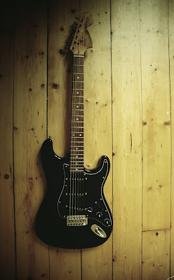
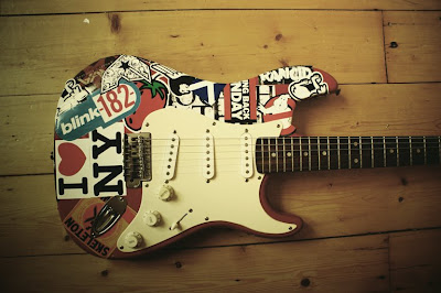
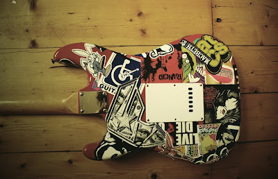 This was my first ever guitar, just a really cheap strat, my plans for this guitar was to give it a nicer neck, maybe a few Seymour Duncan pickups but i couldn't bring myself to touch it as even tho Ive have a few guitars now, everytime i pick this one up, its plays amazing and takes me back to when i was 12 learning in my bedroom struggling to hold the thing. Admittedly i have a sticker fetish so went a bit mad and covered it with everything that reminded me of why i like guitars in the first place, bands that got me into music like rancid, distillers and the cure. I have another guitar lined up that I'm planning to completely spray white and apply my illustrations to, but im going to make that an extended project with no rush to finish.

 Above is the logo to the powerlines series we are currently working on. Were hoping in the next week or so to have some prototypes of screen prints to show. The idea has extended from a series of 3d work i did a few month back entitled _powerlines 1990. Were hoping to print these onto some really nice canvas bags and the same concept as my 3d work, that each bag in the set will join via the powerlines, I'm also working on some nice typography to go with the illustration. I'm hoping that this idea will actually come to something and not end up like most; which seem to find their way scribbled onto a piece of paper at the back of a sketchbook...
Another new drawing! I've done a few illustrations like these in the past couple of weeks - I like working with quite bland colour palletes and using white to bring them to life.
This illustration is loosely based on a photo taken at Cramond Beach a while ago - at the point where the tide stops carrying the shells up the sand.
 Ok, so this was a project i did a few month's ago. The brief was to come up with some kind of pharmaceutical packaging, design, and advertise it. This is the second half of the project which involved creating a removable piece of promotion and ideas for sculpture proposals based around innovative marketing of the chosen product. My product was a medicine box, which would be a fully recyclable, green product (the idea that my box came flatpacked-to re modernise an old existing product and giving it a new identity and the idea that i had to market a product that was essentially "just a box".


A few days ago I bought a shiny Wacom graphics tablet and this is the first thing I've drawn using it. It's been a long time since I last picked up a pen and I'm quite pleased with the results - it's a quick sketch of my cat Minni doing what all cats do best... nothing, drawn in photoshop.
I'm more of an illustrator person, so have stuck to the basic brushes in a few different diameters to complete the drawing.


So a couple of months ago a company asked me to help them re-design a series adverts for them and yesterday I received a hard copy of an exhibition guide in which one of my adverts was featured!
It's all the way back on page 163 of the Maritime Journal with all the other navigation companies but nevertheless I'm very proud and think it turned out pretty well. Apparently it was even given a few compliments from some suppliers which is nice!
Anyway here's a shot!

