
 Ok, so this was a project i did a few month's ago. The brief was to come up with some kind of pharmaceutical packaging, design, and advertise it. This is the second half of the project which involved creating a removable piece of promotion and ideas for sculpture proposals based around innovative marketing of the chosen product. My product was a medicine box, which would be a fully recyclable, green product (the idea that my box came flatpacked-to re modernise an old existing product and giving it a new identity and the idea that i had to market a product that was essentially "just a box".

Tuesday, 30 June 2009
Advertisement Project
Saturday, 27 June 2009
Cat Illustration

A few days ago I bought a shiny Wacom graphics tablet and this is the first thing I've drawn using it. It's been a long time since I last picked up a pen and I'm quite pleased with the results - it's a quick sketch of my cat Minni doing what all cats do best... nothing, drawn in photoshop.
I'm more of an illustrator person, so have stuck to the basic brushes in a few different diameters to complete the drawing.
Thursday, 25 June 2009
Brand New Glasgow Barrowlands


Brand New supported by Kevin Devine and Moneen, Glasgow Barrowlands 24/06/2009
The last time Brand New played in Scotland was back in 2007, Carling Academy; this was a well awaited return from the long island group. Moneen was the first of two support bands, we only caught five or so of their songs and its fair to say they did have a good fan-base, with some nice guitar playing and energetic set. Kevin Devine is a very understated musician, being best friends with Jesse Lacey, its easy to see why his songs are a perfect fit for a Brand New show. The highlight of his set was his cover of Nirvana's "school" which was amazing. Brand New came onto the stage with the first half of their set being old classics from albums like "Your Favourite Weapon" and "Deja Entendu", they slowly progressed into their most recent album throwing in some new songs with Jesse Lacey being as unpredictable and charismatic as ever. At one point he took a jumper a fan had thrown onto the stage and wore it over his head and microphone, throwing himself around the stage and singing on his knees. (and in parts really talking to the crowd which was well received from the fans) As the end of the 19th song set approached, you could see the music visible effecting Jesse Lacey and the band, with the music being more unpredictable and heavier- with Vinny throwing his guitar in the air, Jesse screaming into the guitar it was an amazing proformance.
The final song/interlude was "Welcome to Bankock" featuring members from Moneen and Kevin Devine, with three drummers-it was heavy, complex mixture of sounds that showcased why Brand New continue to be such an important band for music, and continue to better themselves album after album. More videos and pictures to follow.
Setlist:
Monday, 22 June 2009
Sculptural Experiment

Sunday, 21 June 2009
Napier Creative Showcase
Napier University currently have a Creative Showcase website that is showing a few pieces of our work, there's also some really great design work at Napier; take a look.
http://www.napiercreativeshowcase.com/2009/des/
http://www.napiercreativeshowcase.com/2009/des/
Published!

So a couple of months ago a company asked me to help them re-design a series adverts for them and yesterday I received a hard copy of an exhibition guide in which one of my adverts was featured!
It's all the way back on page 163 of the Maritime Journal with all the other navigation companies but nevertheless I'm very proud and think it turned out pretty well. Apparently it was even given a few compliments from some suppliers which is nice!
Anyway here's a shot!

Thursday, 18 June 2009
The TV

This is one of the many pictures taken in a series of compositions in and around Edinburgh
-more coming soon.
On other news, as promised, the website is now up and running and is best viewed in anything BUT Internet explorer (right now were just havng teething problems, but hopefully this will be amended very shortly).
Wednesday, 17 June 2009
Rebellion

"Rebellion" was a slightly alternative outcome for my Illustration module. The brief was open (the worst kind!) and after experimenting with carbon copy drawings and different ideas which didn't go very far I was finally inspired by the mass of terrible graffiti that seems to feature just outwith any lightsource.
The idea was to create my own typography-based graffiti out of moss which would eventually colonize and take over the wall it was on - covering the scribbles with something more organic. It took a while to come up with a title ('let it enfold you' was in my head for a while) but in the end Rebellion was the one that stuck, and I love the idea of natural graffiti fighting against man-made. Trying to claim its space back.
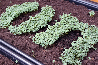
After a month of waiting for the moss to grow, I decided to try and grow typography from a different angle; the ground. Using a couple of trays I planted rocket seeds with a stencil and let them grow until they were a couple of inches tall before transferring them into the ground.
I chose to place the letters beside a well used path through the wood that leads to the shore and is surrounded by ivy covered Roman ruins and leafy trees - a really pretty backdrop where hopefully lots of people will see them!

The Hoax

The Hoax artwork was created as part of a fictional promotion campaign based around crop circles. The idea behind this was that the circle-makers would leave these ambiguous sleeves around that contained a poster and CD with hints towards their latest project.
The outer case is plain white with a translucent band - on the image above you might just be able to make out 'The Hoax' embossed as the only form of identification.
The poster contained inside, however, features a little more colour. For this I was inspired by 80's vinyl - and the layering of watercolour and handrawn typography to create depth. The focal point of the image is a simplified version of the most complicated crop circle created to date; the graphic representation of Pi, which I layered with my own watercolour swatches to give more of an abstract effect. The poem below is by a vinyl artist and I thought it fit perfectly with the whole 'crop circle' ethos and when I added the Pi symbols to the type it really pulled it together.
To finish everything off I printed the poster onto tracing paper to give it a soft, glowy appearance and the impression that everything is sort of dissapearing... and being kept a secret.

Powerlines_1990


 Entitled "Powerlines_1990", this was a small exhibition showing the outcome for my personal project. Using illustrations i had drawn in sepia ink i then created these 3d scenes, linked together by the continuity of these simple understated everyday objects; powerlines. To accompany the exhibition was a series of sounds that echoed the noise of the powerlines again giving this feeling of a journey as you walked from frame to frame, the noises becoming less apparent as you move further away from the last.
The exhibition was located in the hallway of the university and the response i got from people was very good, normally a quite boring corridor, people actually took the time to stop and look at the work. I will soon upload a video of the exhibition so you can see the work close up.
_Untitled
Today i had a few hours spare so i decided to start an idea I've had for quite a while, recently my works seems to be getting more 3d; I've being trying new approaches to illustration and being inspired by some beautiful 8mm short films. This is the beginning to a series of short films i want to create, with more complex scenes and a few illustrated characters...who knows maybe ill make a whole 3d story experimenting with card.
Monday, 15 June 2009
Apertureroom.com (coming soon)
Guitar Project
 Ok, so the first summer project is to start building a guitar. Its something I've wanted to do for a long time, and after buying my 8th guitar i thought it was about time. I bought the pieces from various places and saved up an unhealthy collection of guitar parts; ranging from pickups to scratchplates.I'm first starting work on the body, I've wet sanded the body with p800 which will provide a good surface for the primer. I'm thinking about taking the body to a body shop to get the paint job done professionally, I'm hoping for a surf green finish with some nice Seymour Duncan pickups. After my very first strat guitar's electrics were damaged years ago i managed to teach myself how to rewire the whole pickups back together from schematics diagrams, and nothing feels nicer than playing your first guitar again. There always something nice about picking up a strat- i know there is this whole "Gibson guitars are the best", but I'm in love with my Fender guitars thankyou.

Subscribe to:
Posts (Atom)