Friday, 30 October 2009

RBS Money Re-design


This is one of my routes for the money re-design. The problem i have with this project is my original designs looked like a bank note, but i want to completely erase designing on the pretense of what a bank note "should" look like, why can't a bank note become a piece of graphic art or an object? I'm not going to go into too much detail but my original idea was that each note would become another part to create a pinhole camera, enabling a person to take pictures of what they feel is "Scottish" to them. After alot of head scratching and many cups of tea Ive found away around the mechanics of it. The designs are very much the opposite to a normal bank note, but my aim is to modernise and almost re-invent RBS to a much younger generation.


Summer Harvest Ideas


These are just the start of the design process for my route 1 Belhaven Fruit Ice ideas. Ive tried to simplify some previous more busy designs. I've also played around with the shape of the overall label giving it a modern edge without loosing the professional feel to it. Alot more tweaking with the typography is needed and to add nutritional values,bar code info on etc.

Thursday, 22 October 2009

Belhaven Fruit Ice Concepts (03)

This is the final concept for my Fruition branding. Another one llooadds different from the others!

I've used quite a random illustration with lots of traingles, waves and lines to build up a visual identity for the product that would set it apart from typical things you'd see in a freezer.
I wanted to achieve a really modern, abstract set of designs that could change with each flavour by using slightly chalky colours against metallic lines.

On the reverse of the carton would be the product description with some little illustrative triangles and grassy border to tie in with the main illustration.

Sunday, 11 October 2009

Belhaven Fruit Ice Concepts (02)

This is the second branding suggestion for Fruition. I've chosen an entirely different concept from idea 01 - out with the editorial look and in with the rough and tumble outdoorsy look.

I've used my own typeface(s) with a sketchy, uneven edge mixed with a handwritten font to give it a more playful outlook with soft, summery tones that will appeal to older ages. With the illustrations I've used simple shapes and lines to depict the fruit inside, and in brighter colours so they contrast with the background.

On the reverse of the carton I've used an abstract silhouette of a track bordered by two hedgerows, mainly to take away from the bulk of flat colour but also to add some dimension and perspective.


Saturday, 10 October 2009

Belhaven Fruit Ice Concepts (01)


One of my three routes for the packaging design of Behlaven Fruit Ice. I've used a short typograhpic narrative (typeface: Didot) to try and set the scene with the flavour and product name highlighted, plus a smaller blurb underneath to describe the actual contents a bit more.

Instead of picturing the fruit itself, I have chosen to represent the texture of the fruit ice using silk - giving the impression that it's smooth and luxurious. Also, hopefully giving an idea of the colour inside.

At the moment I can't quite pick beween the full image sleeve and having a small band but I love the simplicity and vibrancy of both!


Monday, 7 September 2009

Places I Have Been

Here's a small preview of what my outcome to the '20x20' project looks like. The whole piece revolves around places I have been - and the things that I can remember thinking, doing or hearing at that exact moment.
Most of the pages are full photographs and show an entire scene or a tiny portion of a bigger landscape, and they have little in common. However, there is a story that flows through the pages that lets you into a number of my most life changing  moments where I've been both happy and distraught 
Some of the pages are annotated with hand-drawn typography in a style that fits the memory and others covered with pattern and illustration, each one unique and different to the last. They don't match, or make sense, but that doesn't matter. Each page is a new chapter.

In contrast, the front cover is simple and uncluttered - the bird symbolizes the different journeys that have been made but eventually return home.


Portrait Picture


After countless number of re-thinking my idea for this portrait picture, i decided to actually portray somebody who i consider an "idol". Vinnie Accardi is the guitarist and co-songwriter in the band Brand New. Ive grown up listening to Brand New from a very young teenager and as the music has grown, Ive grown up with it....
There first album "Your Favourite Weapon" all the way back in 2001 was the very reason i picked up a guitar and struggling to play a single chord. When your starting out playing guitar you think every guitarist is better than you, and you want to be them, and you gradually get better and better and realise those guys you use to look up to and wanted to play their song weren't as good as you thought.
With Vinnie i still look up to him as a musician, and still find myself sitting in my bedroom struggling to play a song or guitar riff...as the band have also progressed over the years; adapting their musical style and become more complex and creating a genre in themselves.
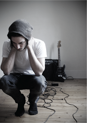
Vinnie is a shy, quiet character who explodes on stage, its fair to say their is music is very much related to their personal lives therefore quite dark, and there is always an undertone of death and religion throughout their music.
With the portrait i have tried to capture the mood of his character, a more sombre feel with soft lighting and desaturated colour to give a completely different feel. Although me portraying him playing the guitar was the obvious choice i felt it just didn't need it, therefore the music theme creates the background bringing the mood of the picture to the foreground becoming the focus of the whole picture.
Although the name "Vinnie Accardi" wont turn many heads for the most popular, iconic man in history...to hell with popularity, this guy changed a small long island band into arguably the godfathers of ours generations punk rock.