

A couple more pictures from the "views from benches" series. This time exploring our disposition to ignore the perfections that already exist in nature.
Tuesday, 26 October 2010


Saturday, 16 October 2010
Views from benches

Here are some of the pictures from a piece of research we conducted this week. It explores how the way we currently live is very ordered and structured... Out lives are so controlled to the point where the way we act and the things we do have already been mapped in front of us.
All of the pictures in this series were taken while sitting in the centre of a park bench and aims to emphasize how even in an apparently unregulated location there is always structure. We placed a clock in and around the setting to try and emphasize the fact that we spend too much time within rigid control, only seeing what other people want us to see.We also received some great feedback from passers by, who would stand and try to guess the meaning behind the intervention.
Of course, no photography update from us would be complete without including an animal or two... so here's an action shot of a squirrel running in our direction after he noticed we had a bag of crisps to bribe him with!


Saturday, 25 September 2010
Autumn

For the last two years I've been trying insistently to get Matt to come to the Edinburgh Botanic Gardens with me to - among other things - check out the Andy Goldsworthy sculpures (above) and feed the squirrels.
Although it took a while, we finally went last Thursday on a really nice, sunny afternoon and though we would share some pictures...


Tea 101

So we're back at Uni now and hopefully that means you'll see some more regular updates to Aperture Room. To get things moving here is the outcome to a short one week task, where we had to pick a process and show it step by step in an A3 format.
Aperture Room are huge tea addicts, so this one was an easy choice. The teacup was inspired by one I picked up over summer in an antiques market and the theme grew from there...

Saturday, 11 September 2010

Thursday, 3 June 2010
Edinburgh galleries
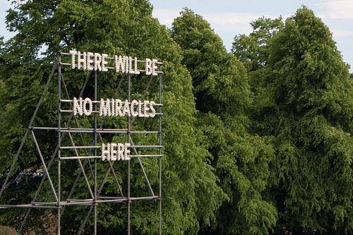
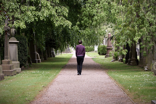
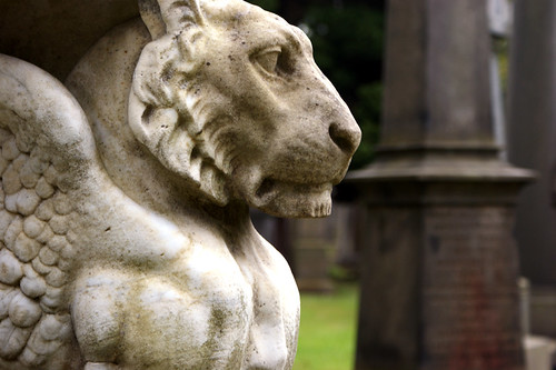
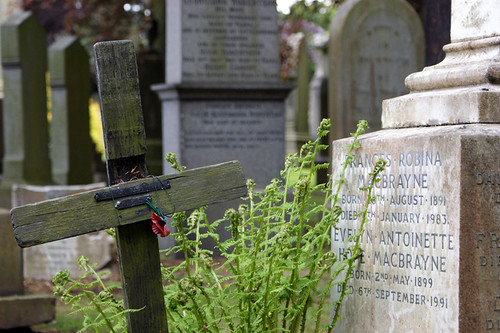
After driving past the galleries in ravelston almost every day for the past few months, we finally decided to visit and check out the work of Nathan Coley up close. Although his work is far more stunning at night, theres still something pretty cool about three foot high, glowing words attached to a pieces of scaffolding. Inside the gallies themselves we visited the Diane Arbus exhibition, where there were hundreds of observational photographs and found a firm favourite in the work of Callum Innes (google images really doesn't do his work justice!).
Afterwards we wondered around the grounds and ventured into the Dean Cemetary - the need for a giant pyramid tombstone is still confusing us - and took a few photographs...
Sunday, 21 March 2010
All Fixed!

Picture-taking has been put on hold the past few weeks while the lens of my camera was being fixed by Sony. But now I finally have it back and have been going snap happy from the sofa! As you can tell from the picture above, the latest Aperture Room obsession is kids sweets... Dib Dabs, Alphabet Letters, Refreshers... so good!
But even better than that, you may be seeing a number of our shots large scale. More information to follow, but exciting news!
Napier 2010 Degree Show

Degree Show Poster
Something kind of exciting that will be happening over the next couple of months is the coming to life of my concept for the Edinburgh Napier Degree Show.
Previously, the degree show was known as the Creative Showcase and was held at Mansfield Traquair. However this year the work is going to be displayed inside the Design School itself... Our class was given the oppurtunity to come up with a new branding solution that included posters, invitations, signage and a wayfinding system to help visitors navigate through the corridors and I was lucky enough to have my idea chosen!
 Invitation Concepts
The concept is based around memories, our inspirations and how we find our way around places. As most people know to turn the corner when they get to the house with the yellow door (or blue, or white...) I used this as the basis to my wayfinding system. Utilising the 'dead' spaces of the corridors I envision huge, interactive spaces/items that can we walked through or around or touched and ultimately enhance the experience of the visitor.

Door Signage Concepts
Above are a number of the print elements which you should look at full size to check out all of the information! I'm sure most of the things will have to be changed a little to be more practical, but until then, here's an idea of what you might see if you come to scrutinise the graduating year's work!
Urban Foragers

A few weeks ago, I said I would post the full version of my The Body Shop D&AD entry.. and here it is! These are the boards I uploaded online so the writing isn't crystal clear, but I'm sure if you squint a little you'll be able to work out all the posters...

Fingers crossed and all that good stuff!
Friday, 5 March 2010

Thursday, 4 March 2010

Wednesday, 3 March 2010

Monday, 1 March 2010
Tuesday, 16 February 2010
Like Lions Do
 One of the most enjoyable things that we've done so far at Uni is in one of our current modules - film and animation. The brief was to create a 3 minute film, set to music, that showed a journey from one point in the city to another.
Izabella, Matt and I chose to set our film in Cramond, where we thought there would be lots of interesting things to record between the beach, woods, ruins and pub. It turns out we did, and although its not quite finished yet - we are all really pleased at how the movie is coming together - and hopefully we'll be able to post it here when it's all finished!
Until then, here are some of the shots that were taken while we were out and about with the camera...


To Do List

1. Start drawing in the sketchbook thats been lying about for the last couple of months... first page fears!
2. Begin making jewellery again, even if that includes squirrels and owls
3. Book a holiday somewhere nice and sunny
4. Learn how to make burritos! After having some at Chilango's last weekend, Aperture Room are officially obsessed!
5. Use my camera more. I was given two new lenses last week - a macro (which took the above image) and a super-wide angle (partner in crime - below), so want to get some proper use out of them! It's nice being able to see more than 18-70mm!

Snowdays

Usually I would say that I love the cold, crisp weather that we've had recently - but right now I'm bored sick of it and cant wait for the day that I can leave the house without 2 pairs of socks, 3 jumpers and a scarf on!
That said, I've got some really nice photo's from when I've ventured out with the camera and thought I'd throw a couple up that I took on Christmas Eve... yep, I'm a bit behind with the times. The one above was taken from Cramond and looking out over the island. The one below was taken standing on top of my car, and over a carpark in Dunfermline.

The Body Shop

The first project of 2010 (is anyone else still writing 2009?) - to complete The Body Shop brief for the D&AD awards.
This is a preview of one of a set of posters to be used in a campaign, along with some other components. But I'll post everything up after the closing date - if I'm entered!
Scottish Historic Buildings Trust

Another final solution to a brief set by the company themselves... this time by the Scottish Historic Buildings Trust, to come up with a new identity as they combined three different Trusts into one.
The idea was to completely neutralize the existing design and use dynamic imagery to enhance the company's portfolio across their website, business cards, brochures etc, while retaining a visual stamp that was memorable and easily reproduced. I was lucky enough to be one of four students who represented their concept to the board of Trustee's, but in the end another identity was chosen to be used!
Update
Wow, it's been a while since this blog was updated. It's starting to look a bit sorry for itself really, so I'm going to take the initiative to post some updates of work that was eventually finished from last semester - and other bits and pieces from along the way.
That, and I have other things I probably should be doing right now... yay for procrastinating!
Belhaven Fruit Ice Final Concepts

This was my final solution to the brief that we received from Belhaven Fruit Farm to redesign the packaging (and potentially rename) their Fruit Ice product.
The concept was based around illustrating the growth and elements involved in creating the ingredients, so I used fresh colours and simple line drawings of fields, rain, clouds and fruit to enhance the playful feel.
Subscribe to:
Comments (Atom)
